1. Performance Charts using Log Scale (TRANSCRIPT BELOW)
- Many of our performance charts on a log scale.
- The main reason for this is to give a fair image of portfolio variability over long periods time.
- It is not important to know the math being the log scale
4 minutes
Our performance charts are designed to give a fair image of the historical price variability and price changes. We do this by showing model portfolio performance on a log scale. The math behind the log scale is not important.
The important point is that they show similar percentage point changes in price as the same graphical distance, regardless of when the variability takes place over the time span shown. This practice will help you see the long-term price changes more realistically.

This is a screenshot from Bloomberg of the price history of the Dow Jones Industrial Average beginning on the left-hand side at around 1920. On the right-hand side of the chart is the current period, very close to where we are now. The vertical scale is linear; it begins at a price of zero, and the tick marks indicate $5,000, $10,000, $15,000, and $20,000. On this graph, we see that there’s a lot of price movement up and down over the last couple of years.
The variability we're seeing appears far more dramatic over the recent time period than it was over the early time period. It looks like all the variability in prices and all the big increases have taken place recently. This is what happens when we view things on a linear price scale, where there's a consistent dollar amount between each of the marks on the right-hand scale for price.
But if we look at a different scale, a log scale, we get a different picture. The important thing that it does for our charts is it gives us a fair image of the risk—the variability—over the long performance horizon, because at Focused 15 Investing, we want to make sure to increase return and reduce variability over a long period of time. Thus, the log scale helps us see these long historical periods in their full detail.

This image gives us a better idea of what's taken place. The graphical distance, for example, from the peak in 2007 to the trough in 2009, represented by the red diamond, is the same percentage point decline as this other red diamond way off to the left. In 1937, we had a decline that was very similar in scale in percentage point terms to what we experienced in 2008 and 2009.
We can see the variability in the very large decline that started in 1929 and ended several years later. Next, we see the Depression years, then the run-up during the war, and finally a peak in 1966. Then prices were relatively flat until 1981, after which they moved up. Next was the internet boom, the collapse in 2008 and 2009, and the current period.
The variability, in terms of percentage points differences, over the last couple of years has not been as dramatic as some of these other periods of volatility. That's shown effectively on this log scale. This is why most of the charts that we use in Focused 15 are on a log scale: to give adequate representation to the longer-term variability of the return series.

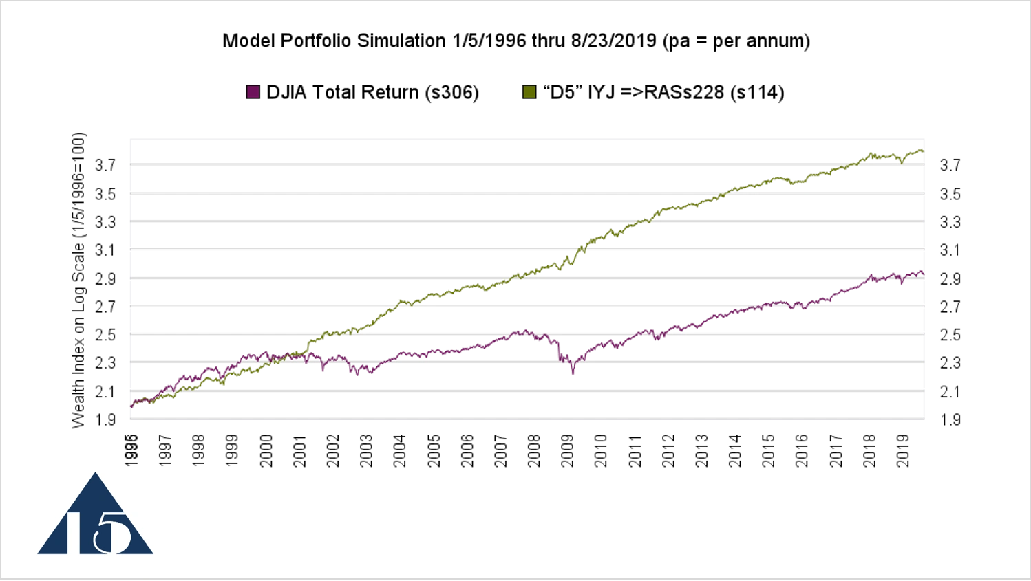
This is an example of a chart from a Focused 15 model portfolio. This is on a log scale, beginning, in this case, on January 5, 1996, set at 100, which shows as a 2 on the vertical log scale. The model portfolio is shown by the green line. It is moving in a diagonal fashion at a relatively constant slope.
The constant slope means that the rate of return is relatively consistent from year to year. The lower line represents the performance of same ETFs held in the model portfolio WITHOUT changing their weights over time in response to the resilience cycles, which makes it a reasonable comparative benchmark for the model portfolio. Thus, in a Focused 15 performance chart, when we see a straight line going up with a steeper slope than its comparative benchmark, that's a good thing.
PO Box 996, Lynden, WA 98264, USA
Cookie Policy
This website uses cookies. By continuing to use this site, you accept our use of cookies.