3. Objectives and Comparative Benchmarks (TRANSCRIPT BELOW)
There are three main reference points to evaluation the performance of our model portfolios:
- A benchmark mix of ETFs created for your specific model portfolio that indicates the gains and losses of the model portfolio's ETFs held at aggressive weights
- The performance of alternatives you have for investing your retirement accounts
- Performance of major market indexes, such as the Dow Jones Industrial Average
This article discusses the importance of the return-to-variability ratio
9 minutes
For a majority of Focused 15 Investing model portfolios, the main objectives are:
- To avoid major losses
- To recover quickly from losses that do occur
- To get a favorable return for the level of variability (magnitude of temporary losses) that one must endure to get the higher return.
The key comparative benchmarks that we show in the Focused 15 Investing publications are as follows:
- The upper risk mix (URM) consists of the ETFs in the model portfolios held at constant weights in an aggressive stance over time.
- Vanguard Balanced Funds (VBINX) are used to demonstrate the investment portfolio or program you would be doing if you weren’t using Focused 15 Investing. This is a little bit harder for us to evaluate, but the VBINX represents what most investors would use
- The Dow Jones Industrial Average (DJIA) represents the stock market in general. We use the DJIA because it has a long history and because it is important index for our investment strategy.
Let us look more closely at the URM that is shown in the publications. As a reminder, this mix consists of the same ETFs that are in the model portfolio, but the weights are stable over time. In addition, their constant weights represent an aggressive stance. By this we mean that the URM has a very high allocation to stocks. For example, if the maximum weight a model portfolio can have in the DJIA-linked ETF is 70%, the URM holds that 70% allocation to the DJIA at all times.
This constant aggressive stance gives us a sense of the largest magnitude of the gains and losses possible with the model portfolio. But this mix gives a good indication of variability of the underlying ETFs without actively rotating among them. It is challenging benchmark. Over some periods of time, the model portfolios can be expected to underperform this aggressive mix, especially when the stock market is moving higher.
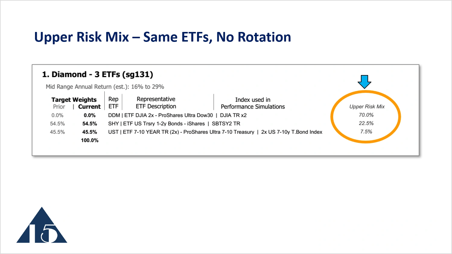
The upper risk mix is shown in the publications at the upper right, as in the above image of one of the model portfolios. The image also shows the current target weights, representing the asset allocation decisions and the ETF rotation decisions that come from the Focused 15. In this case, the upper risk mix indicates 70% of the portfolio’s assets are held in ETF DDM. In the image, the current target weight shows 0% allocation to this stock-related ETF.
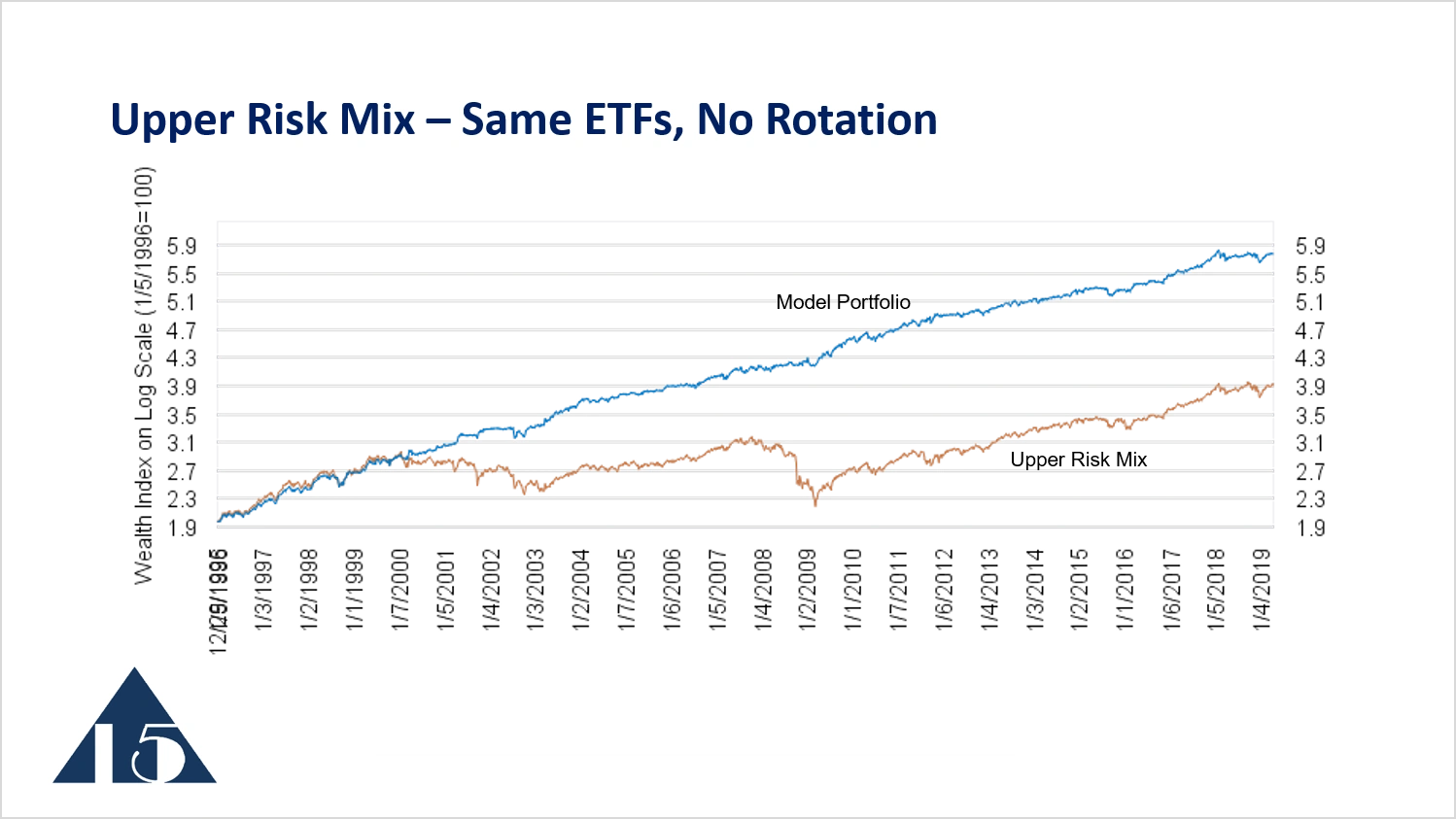
The upper risk mix is shown in the tan line. We can see in this early time period, beginning in 1996, that the model portfolio, in blue, actually underperforms the upper risk mixed during the early part of the period. But when the stock market and the upper risk mix start to decline beginning in 2000 through to 2003, the traded portfolio moves higher. So clearly the model portfolio is superior. It has better returns and better loss avoidance than the upper risk mix.
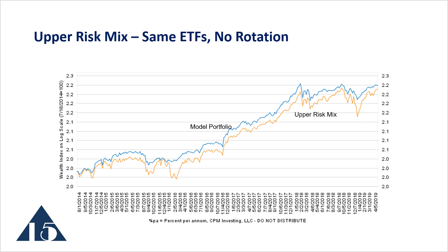
Looking at the upper risk mix over a shorter period of time, 2014 to 2019, we see the model portfolio outperforming the upper risk mix and then keeping pace with the upper risk mix when the market moves higher. Then, during the period of volatility, the model portfolio avoids some of the losses of the upper risk mix.
The second comparative benchmark that we show on the Focused 15 Investing newsletters is intended to be a proxy for what subscribers might do if they weren't using Focused 15 Investing. A common asset allocation for many investment products is to hold 60% in stocks and 40% in bonds. The Vanguard Balanced Index Fund (VBINX) has that stable allocation of 60% in stocks and 40% in bonds, so we show that on many of our reports as a comparative benchmark.
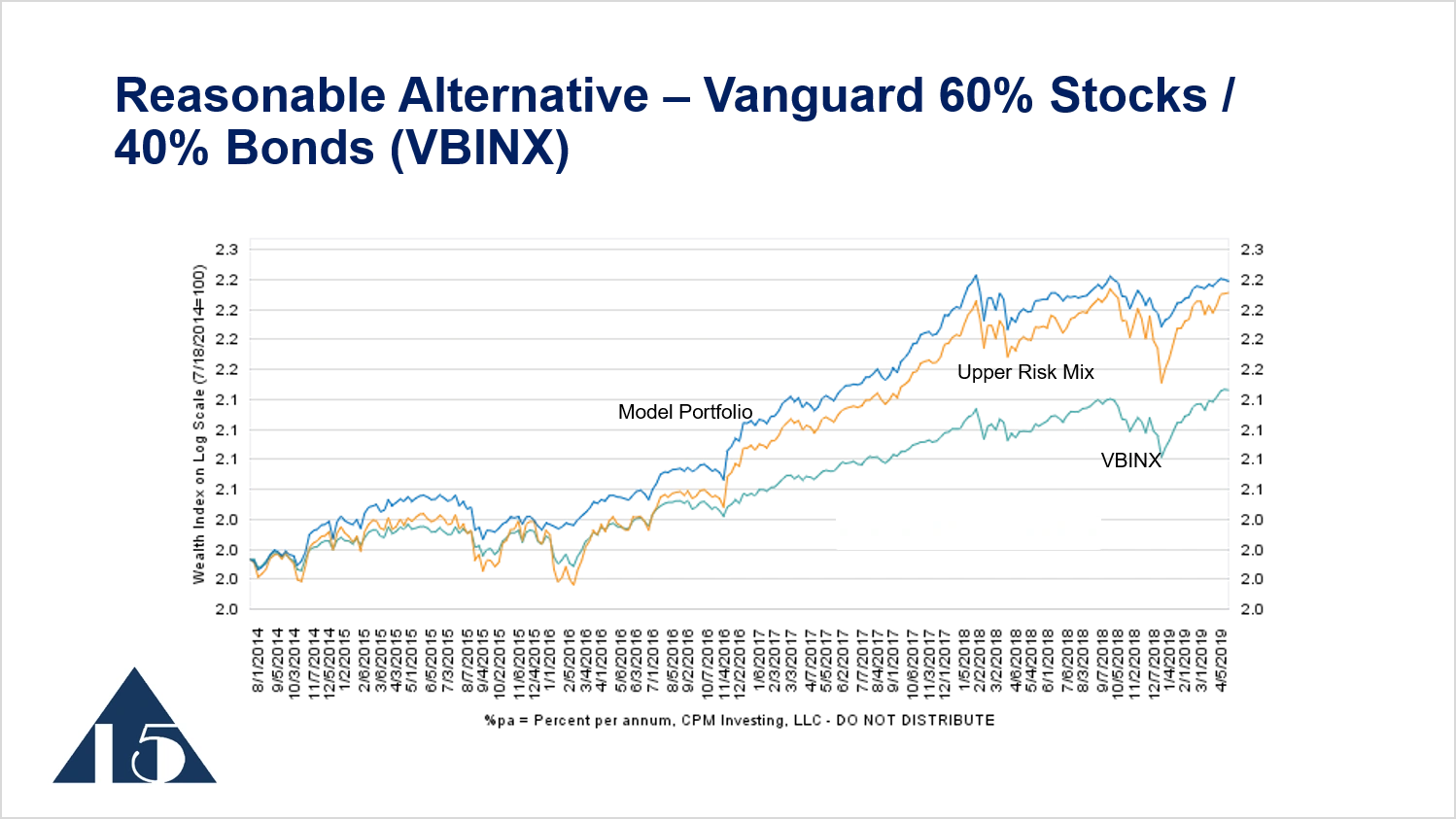
If we include the performance of VBINX on the chart in light blue, it is clear that the traded portfolio does reasonably well during the strong upward-trending market from the period of 2014 to April 2019, and it outperforms the upper risk mix. But it also outperforms the alternative for many investors, like VBINX, by an even greater margin. So that is the second comparative benchmark, something that represents a reasonable alternative to the Focused 15 Investing model portfolios.
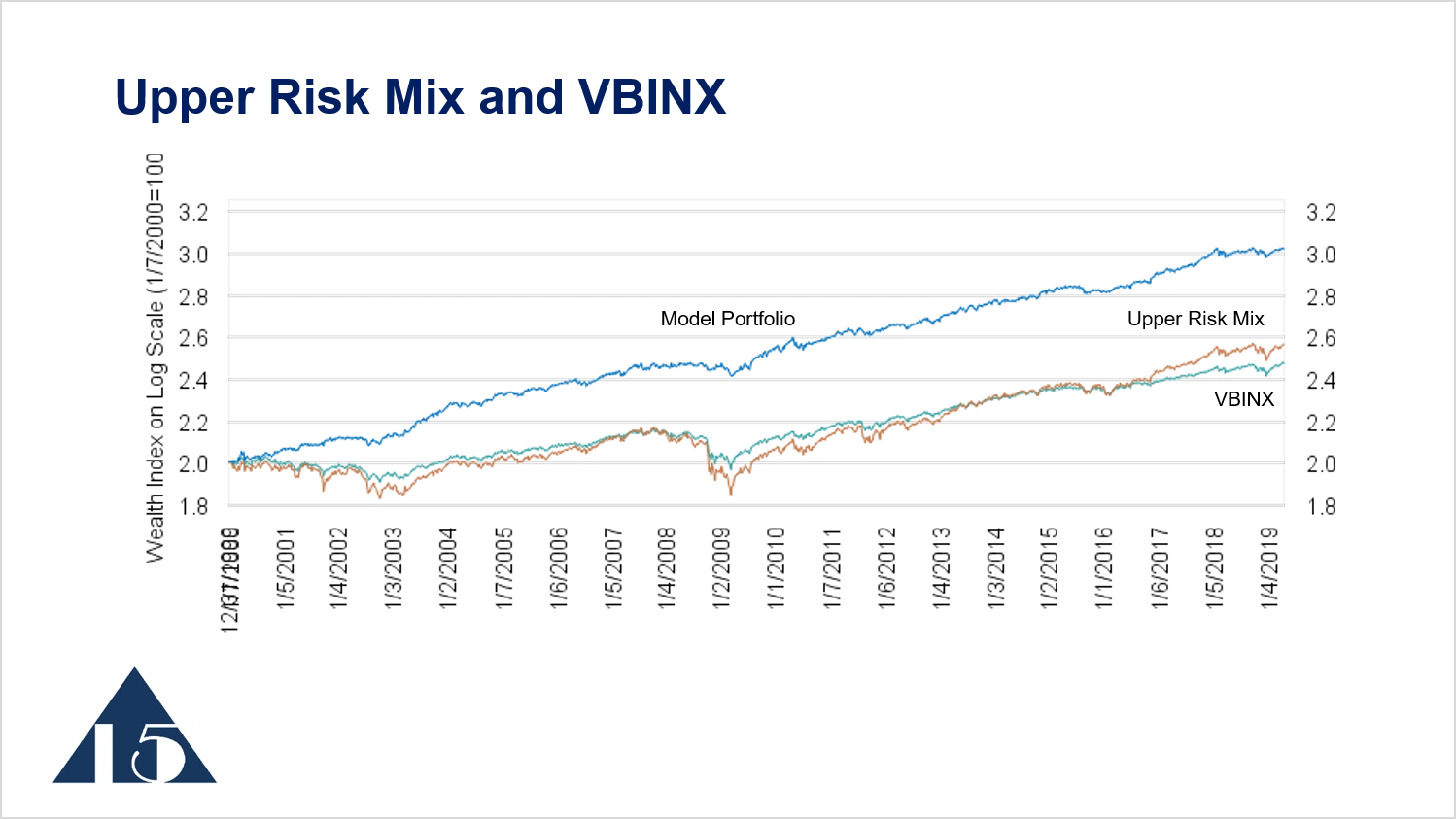
If we put those comparative benchmarks on this longer-term chart that begins in the year 2000, we see that the upper risk mix moves higher and lower more dramatically than some of the other series. The VBINX is more conservative and doesn’t move as high as the upper risk mix in the later period. The model portfolio, representing the ETF rotation strategy, performs better than both those comparative benchmarks over this long time horizon.
The third comparative benchmark is simply the Dow Jones Industrial Average. This is attractive to us because it has a long history. It’s an important investment in many model portfolios, and it’s good for longer-term risk comparisons.
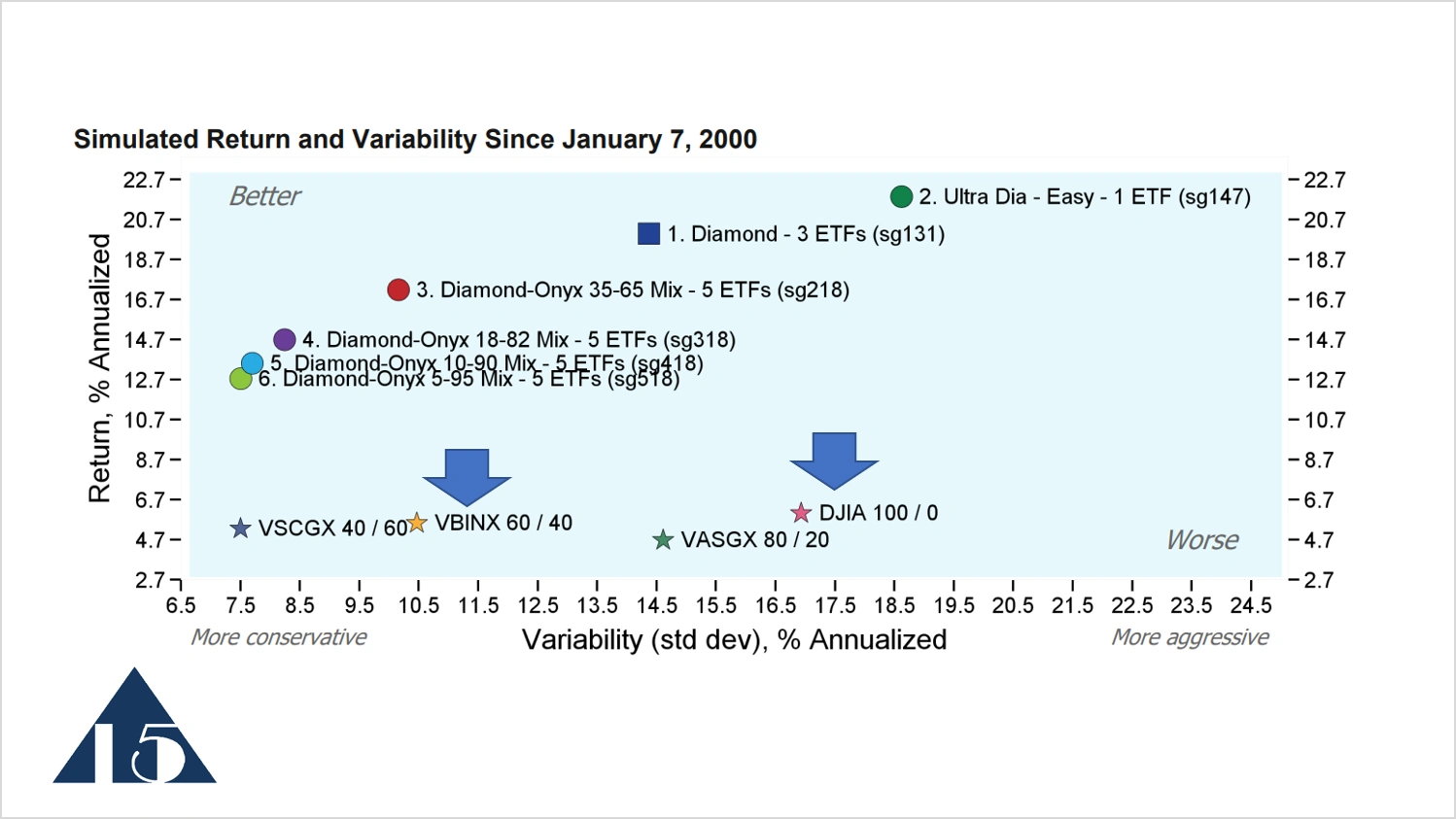
This is a risk and return chart that appears in the top of Focused 15 Investing weekly publications. The vertical axis is the Return, which in this case is simply the return of the simulations January 7, 2000 through March 13, 2019. The horizontal axis is the Variability, which is, again, the standard deviation of weekly returns on an annualized basis. The numbers on both axes annualized, which indicates the average annual level.
Investments in the upper left hand quadrant of this chart are most attractive. It has high return and low variability, which is a good thing, and is better, as indicated by this label. The opposite lower left hand quadrant is high variability and lower return, which is worse. The fund VBINX is shown in this spot and has a return of about 5% annualized since 2000. The variability is just about 10.5%. The DJIA has variability of about 17% and a return a little bit higher than that of VBINX, of about 6%. The model portfolios have performed well in simulation over this time period. VBINX and DJIA, give you a good idea of the level of return and variability that many investment programs offer relative to the Focused 15 Investing model portfolios.
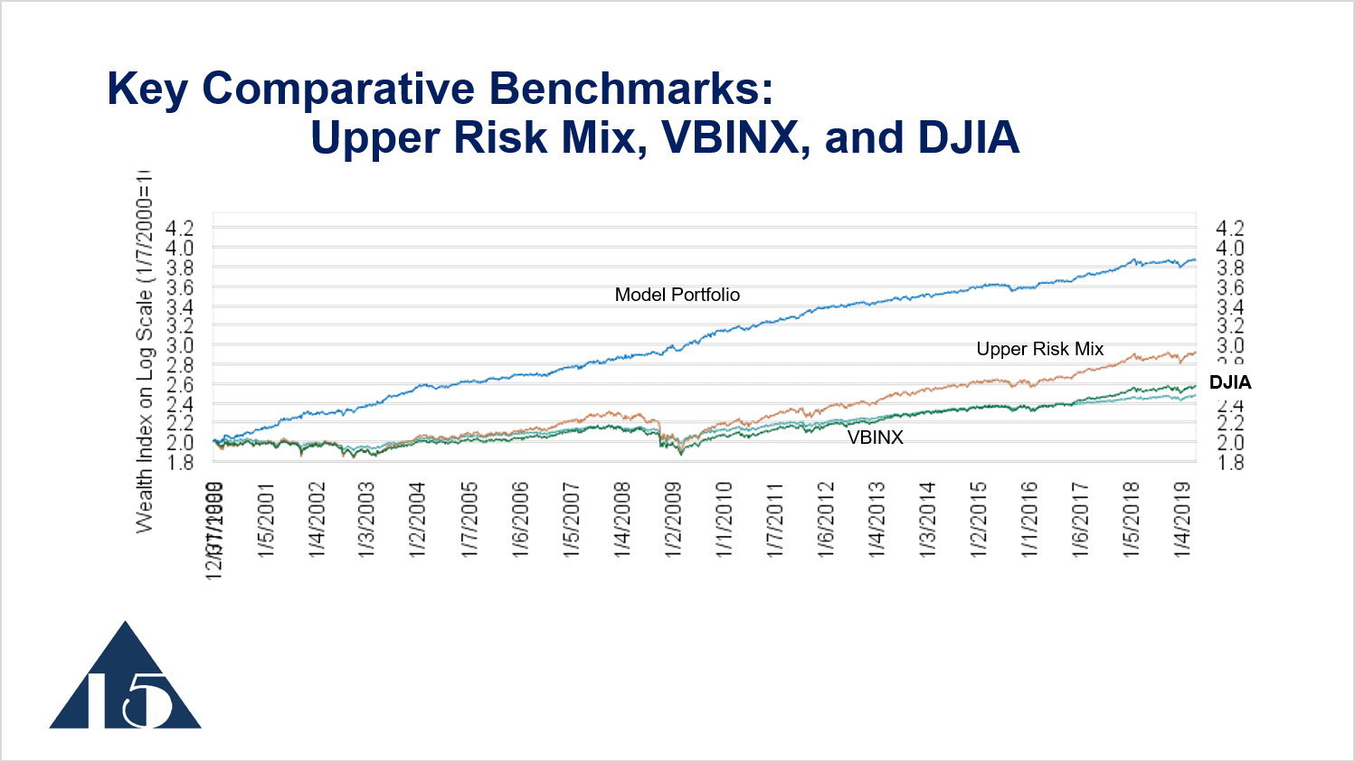
If we put together the three comparative benchmarks, the Upper Risk Mix, VBINX, and the DJIA, we get an idea of how the model portfolio performs. These lines moving across the bottom are those three comparative benchmarks. VBINX is the turquoise line, the DJIA is the dark green line, and the upper risk mix is the tan line.
Return-to-Variability Ratio
A key metric that we look at, particularly over mid to longer periods of time, is the ratio of return to variability. The table at the bottom of the chart shows the rate of return on an annualized basis for these different investments. The Model Portfolio has annualized return of 11.9%, the upper risk mix has a return of just slightly less, 11.4% on annualized basis. VBINX has a return of 7.1%. The variability, which is the standard deviation of weekly returns on annual basis, is 9.5% for the model portfolio—quite a bit less than upper risk mix’s variability of 13.3%. VBINX has variability that is lower than the others at 7.8%.
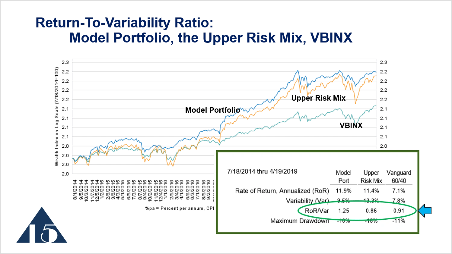
If we calculate a ratio of the rate of return to the variability, this ratio becomes a very useful metric to compare the attractiveness of these different return series. The ratio of return to variability for the model portfolio is 1.25. For the upper risk mix, it is 0.86, and for VBINX, it’s 0.91. So from this perspective, the Focused 15 model portfolio has higher return for the amount of variability that one must endure to get that return. Over the long term, three or four years or more, my goal is to have the ratio of return -to -variability ratio of the model portfolio be at least 0.3 greater than these other reference portfolios. This is a key statistic, and in this case, it is clearly higher.
PO Box 996, Lynden, WA 98264, USA
Cookie Policy
This website uses cookies. By continuing to use this site, you accept our use of cookies.